Can QR codes be any color? The contrast rules that decide it
Yes, almost any color works. But scanners do not see color at all, they see one brightness threshold, and that changes which rules actually matter.
Someone in brand always asks. The code is black, the deck is not, and black looks like a placeholder somebody forgot to style.
The good news is that you can change it. QR code colors are genuinely flexible, and a navy code on a cream card can scan just as reliably as the black one. The catch is that almost every guide explains this with the wrong mental model, which is why people follow the advice and still end up with a code that fails on half the phones in the room.
Here is what scanners actually do, and which rules fall out of it.
Scanners do not see color. They see one threshold.
A scanner does not look at your code and ask whether that square is navy. It converts the image to brightness values, finds the brightest thing in the frame and the darkest thing in the frame, and sets a single cutoff halfway between them. Everything above the cutoff is a light module. Everything below it is a dark module.
That midpoint has a name in the barcode standards. It is the global threshold, and it is computed per image, not per color. Your code is not judged against a table of approved colors. It is judged against a line drawn between its own lightest and darkest points.
Three things follow from that, and they are the whole article:
Hue is irrelevant. Only brightness matters. Two colors that look completely different to you can sit on the same side of the threshold and merge into a solid block.
Your extremes set the line. The brightest and darkest parts of the code decide where the cutoff falls, which means every other tone in the design is measured against a line those two chose.
Distance from the line is what buys reliability. A module that sits just barely on the correct side decodes in perfect light and fails in a dim room. The standards call this modulation, and it is graded separately from contrast for exactly that reason.
Most color advice only covers the first point. The second and third are where real designs break.
Where the 4.5:1 rule actually comes from
Every guide on this topic quotes a contrast ratio. Usually 4:1, sometimes 4.5:1, occasionally 7:1 for safety.
Worth knowing: that number is borrowed. The 4.5:1 figure comes from WCAG, the web accessibility guidelines, and it describes how legible body text is to a human eye on a screen. It was never written for scanners, and no QR standard contains it.
The barcode standards use a different measure. ISO/IEC 15415, which defines print quality for 2D codes, uses symbol contrast: the reflectance of the lightest module minus the reflectance of the darkest one. Not a ratio, a subtraction. And it grades the result rather than passing or failing it.
| Symbol contrast | Grade | What it means in practice |
|---|---|---|
| 70% or more | 4 (A) | Black on white territory. Scans in bad light, on bad paper. |
| 55 to 70% | 3 (B) | Most well-chosen brand colors land here. |
| 40 to 55% | 2 (C) | Works, but you have spent your margin for error. |
| 20 to 40% | 1 (D) | Fails on worn print, low light, or older cameras. |
| Under 20% | 0 (F) | Does not scan. |
None of this means the WCAG number is useless. It is a decent proxy, it is free to check, and there is a contrast checker in every design tool. Use it. Just know that passing 4.5:1 means your colors are probably fine, not that they meet a barcode standard, because the barcode standard is measuring reflected light off paper and your contrast checker is measuring sRGB values on a monitor.
The practical translation: treat 4.5:1 as the floor and 7:1 as the number you actually want. Black on white is 21:1. You have a lot of room between those.
The pairs that work, and the ones that quietly do not
The reliable pattern is dark modules on a light background. Not because scanners are fussy about it, but because that is what nearly every decoder was tuned on and what every printing process handles best.
| Pair | Verdict | Why |
|---|---|---|
| Black on white | Safest | Maximum separation, nothing to go wrong. |
| Deep navy on cream | Good | Both far from the threshold, warm background reads as light. |
| Dark brown on beige | Good | Classic boutique combination, plenty of room. |
| Forest green on pale yellow | Check it | Usually passes, but green carries a lot of perceived brightness. |
| Medium gray on white | Risky | Passes on screen, closes up once ink spreads on paper. |
| Red on dark blue | Fails | Two mid-tones. They look opposite and measure nearly identical. |
That last row is the one that catches people. Red and blue are as visually distinct as two colors get, and a scanner sees two grays about the same distance from the cutoff. If a pair feels like it should obviously work because the colors clash, that instinct is measuring hue, and hue is the one thing the scanner throws away first.
Gradients, multiple colors, and logos
This is where the threshold model earns its keep.
Standard advice is to avoid gradients. That is not quite right, and it is not very useful. The accurate version: a gradient is fine as long as its lightest stop still lands clearly on the dark side of the threshold. Navy fading to teal is fine. Navy fading to sky blue is not, because the pale end of that ramp drifts toward the cutoff and the modules there lose their modulation first.
So the rule for any code with more than one color in it is this. Evaluate your lightest dark module, not your average one. The average is meaningless. The scanner never sees an average. It sees each module, individually, measured against a line your extremes already set.
Two more consequences worth holding onto:
The corner squares and alignment patterns must be solid. A gradient running through a finder pattern changes the proportion the camera is hunting for. Keep those a single flat dark color even if the data modules are doing something more interesting.
A logo eats from the same budget as your colors. Error correction covers a fixed amount of damage. If you spend some of it on a logo and some on marginal contrast, the two costs add up rather than staying in separate columns. Big logo, high contrast. Marginal contrast, small logo. Not both.
One more thing that is easy to miss: the quiet zone counts as background. It is often the brightest thing in the frame, which means it helps set the threshold. Coloring the margin to match a design panel rather than the code background works against you twice. There is more on that in our guide to the quiet zone.
What happens between your screen and the paper
Your monitor emits light. Paper reflects it. The color you approved is not the color that ships, and the gap almost always runs in the direction of less contrast.
Three specifics that matter for QR code colors in print:
RGB to CMYK shifts your color. Saturated blues and greens in particular go flatter and lighter after conversion. Convert to CMYK yourself and re-check the contrast on the converted values, not the ones in your design file.
Rich black is the wrong black here. Building black from all four inks looks deeper on large fills, but presses lay down one plate at a time. A fraction of a millimeter of drift puts a cyan fringe on every module edge, and QR modules are small enough to care. Set the dark modules to 100% K only.
Ink spreads. Uncoated and recycled stock wicks ink outward, thickening dark modules and narrowing the light gaps between them. A mid-tone that measured fine in the file gets darker and fatter on the page. This is one of several ways paper behaves differently from a screen, which we go through in why QR codes fail on paper.
When the brand color simply does not work
Plenty of brands are built on mid-tones and pastels. If your primary is a coral or a soft sky blue, it is not going to make a scannable module color, and no trick changes that.
The ladder, in order of how much you give up:
Darken the brand color for this one use. A deeper shade of the same hue usually still reads as on-brand and gets you the separation you need.
Use the brand color for the background instead, with a near-black module color on top. This is the most underused option and it usually looks better than the reverse.
Put the brand color in the frame around the code. Outside the quiet zone, not inside it. The code stays high contrast and the brand still lands.
Leave the code black. Nobody has ever complained about a black QR code. They complain about ones that do not work.
If a code with your chosen colors is already out in the world and failing, the color is only one of the usual suspects. Our troubleshooting guide covers the rest.
The honest version
Contrast math is a proxy for a physical measurement nobody outside a print QA lab is going to run. Symbol contrast is measured with a calibrated verifier under controlled 45-degree lighting. You are checking hex values in a browser tool. Those are not the same thing, and the gap between them is exactly the margin you should be leaving.
So use the numbers to rule things out, not to sign things off. A pair that fails 4.5:1 is dead and you have saved yourself a print run. A pair that passes at 5:1 is a candidate, not a decision. Print it, scan it on three phones, one of them old, in the worst light the code will ever live in.
And if the brand conversation is taking longer than the print deadline: black scans. It has always scanned. It will still scan on the phone somebody buys in four years.
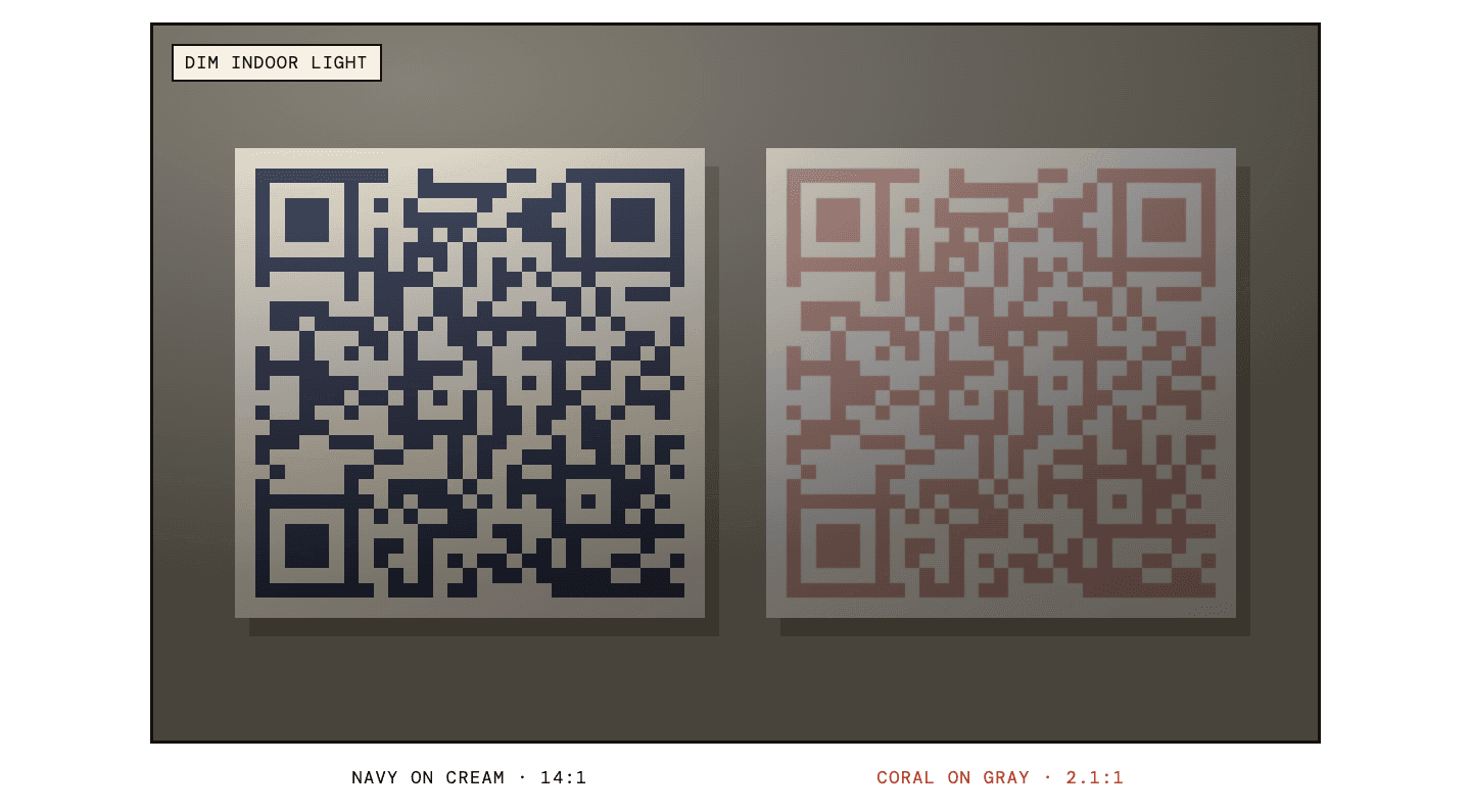
Pick your colors, keep your contrast.
scanbam lets you set module and background colors and hands you SVG, PNG and PDF. Check the pair before you print, not after.
Open the generatorQuestions people ask about QR code colors
Can QR codes be any color?
Almost. Any hue works as long as the modules are clearly darker than the background. Scanners convert the image to brightness and compare everything to a single cutoff, so two colors of similar brightness fail no matter how different they look.
What contrast ratio does a QR code need?
4.5:1 is the commonly quoted floor and 7:1 is a safer target. That number comes from web accessibility guidelines rather than any barcode standard, so treat it as a useful proxy. The barcode standards measure symbol contrast off printed paper instead, and grade it rather than passing or failing it.
Can a QR code be white on black?
Sometimes. Many decoders handle inverted codes, some do not, and you cannot control which phone gets used. If you go inverted, test on at least five devices including older Android handsets.
Do gradient QR codes work?
Yes, if the lightest part of the gradient is still clearly darker than the background. Keep the three corner squares a solid flat color, since a gradient running through them changes the pattern the camera looks for.
Why does my colored QR code scan on screen but not in print?
Usually the color shifted. RGB to CMYK conversion flattens saturated colors, ink spreads on uncoated paper, and rich black misregisters at small sizes. Check the contrast on the converted CMYK values and set dark modules to 100% K only.